
颜色渐变已成为现代数字设计的基石,提供颜色之间的平滑过渡,从而创造深度、动感和视觉趣味。在这份综合指南中,我们将探索如何在数字应用程序中有效地使用渐变,特别关注网页开发和设计。
渐变是两种或多种颜色之间的逐渐混合,创建可应用于各种数字元素的平滑过渡。渐变可以是线性的(沿着直线路径)、径向的(从中心点发出)或圆锥形的(围绕中心点旋转)。
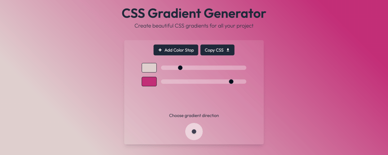
虽然任何颜色都可以混合来创建渐变,但并非所有颜色都能很好地混合。这就是为什么在将渐变添加到 css 文件之前能够预览渐变是很有趣的。这就是 colorlab 等工具及其渐变生成器派上用场的地方。
蓝色渐变在数字设计中特别受欢迎,因为它们具有多功能性以及与信任、稳定和专业精神的心理联系。使用蓝色渐变时,请考虑以下方法:
单色蓝色渐变:通过在不同深浅的蓝色(从浅色(#e6f3ff)到深色(#003366))之间过渡来创建深度。这种技术对于企业网站和金融应用程序非常有效。
蓝白渐变:这些渐变可以营造出轻盈感,非常适合英雄部分或背景。在 css 中,您可以将其实现为:
.blue-white-gradient {
    background: linear-gradient(to right, #0066cc, #ffffff);
}
css 提供了用于创建和自定义渐变的强大工具。主要类型如下:
.linear-gradient {
    background: linear-gradient(45deg, #starting-color, #ending-color);
}
.radial-gradient {
    background: radial-gradient(circle, #starting-color, #ending-color);
}
.multi-color-gradient {
    background: linear-gradient(to right, #color1, #color2 50%, #color3);
}
黑色渐变可以为您的设计增添精致感和戏剧性。以下是有效的使用方法:
.black-fade {
    background: linear-gradient(to bottom, rgba(0,0,0,0.8), rgba(0,0,0,0));
}
.black-gray-gradient {
    background: linear-gradient(to right, #000000, #4a4a4a);
}
绿色渐变可以传达生长、自然和可持续性。以下是一些有效的实现:
.nature-gradient {
    background: linear-gradient(135deg, #2ecc71, #27ae60);
}
.green-depth-gradient {
    background: linear-gradient(to bottom right, #98ff98, #228b22);
}
性能优化
辅助功能注意事项
响应式设计
.complex-gradient {
    background:
        linear-gradient(45deg, rgba(0,0,255,0.5), transparent),
        linear-gradient(-45deg, rgba(0,255,0,0.5), transparent);
}
@keyframes gradient-animation {
    0% {background-position: 0% 50%}
    100% {background-position: 100% 50%}
}

.animated-gradient {
    background: linear-gradient(270deg, #blue, #green, #black);
    background-size: 200% 200%;
    animation: gradient-animation 3s ease infinite;
}
掌握数字设计中的渐变实现为创建具有视觉吸引力的现代界面开辟了无数的可能性。无论您使用蓝色、黑色、绿色还是任何其他颜色组合,了解渐变创建和实施的技术方面都将帮助您创建更复杂、更有吸引力的数字体验。
以上就是了解数字设计中的颜色渐变:综合指南的详细内容,更多请关注php中文网其它相关文章!

每个人都需要一台速度更快、更稳定的 PC。随着时间的推移,垃圾文件、旧注册表数据和不必要的后台进程会占用资源并降低性能。幸运的是,许多工具可以让 Windows 保持平稳运行。

 广告
广告Copyright 2014-2025 https://www.php.cn/ All Rights Reserved | php.cn | 湘ICP备2023035733号


 364
364


 收藏
收藏


