
这篇文章主要介绍了css实现背景图片透明而文字不透明效果的两种方法,需要的朋友可以参考下
摘要:
方法一(毛玻璃效果):背景图 + 伪类 + flite:blur(3px)
方法二(半透明效果):背景图 + 定位 + background:rgba(255,255,255,0.3)
CSS实现背景图片透明,文字不透明效果的两种方法
立即学习“前端免费学习笔记(深入)”;
项目中经常会用到背景图上放一些文字介绍,这里介绍两种技术来实现背景图片透明,文字不透明效果,记录一下,方便日后学习。
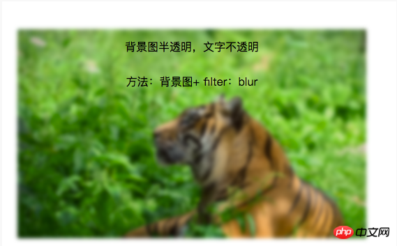
1.毛玻璃效果:
背景图 + 伪类 + flite:blur(3px)
.demo1{
    width: 500px;
    height: 300px;
    line-height: 50px;
    text-align: center;
}
.demo1:before{
    background: url(http://csssecrets.io/images/tiger.jpg) no-repeat;
    background-size: cover;
    width: 500px;
    height: 300px;
    content: "";
    position: absolute;
    top: 0;
    left: 0;
    z-index: -1;/*-1 可以当背景*/
    -webkit-filter: blur(3px);
    filter: blur(3px);
}<p class="demo1">背景图半透明,文字不透明<br />方法:背景图+ filter:blur</p>
2.半透明效果:
背景图 + 定位 + background:rgba(255,255,255,0.3)
.demo2-bg{
    background: url(http://csssecrets.io/images/tiger.jpg) no-repeat;
    background-size: cover;
    width: 500px;
    height: 300px;
    position: relative;
}
.demo2{
    position: absolute;
    left: 0;
    right: 0;
    top: 0;
    bottom: 0;
    width: 500px;
    height: 300px;
    line-height: 50px;
    text-align: center;
    background:rgba(255,255,255,0.3);
}
<p class="demo2-bg">
    <p class="demo2">背景图半透明,文字不透明<br />方法:定位+ background:rgba(255,255,255,0.3)</p>
</p>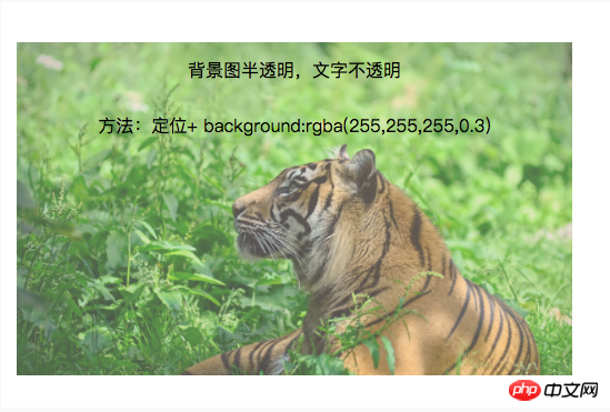
以上就是介绍两种利用CSS实现背景图片透明而文字不透明的特效代码的详细内容,更多请关注php中文网其它相关文章!

每个人都需要一台速度更快、更稳定的 PC。随着时间的推移,垃圾文件、旧注册表数据和不必要的后台进程会占用资源并降低性能。幸运的是,许多工具可以让 Windows 保持平稳运行。

 广告
广告Copyright 2014-2025 https://www.php.cn/ All Rights Reserved | php.cn | 湘ICP备2023035733号


 328
328


 收藏
收藏


