这篇文章通过实例代码给大家介绍了利用css实现立方体360度旋转效果的方法,实现后的效果非常炫酷,而且实现的代码非常简单,对大家的理解和学习很有帮助,有需要的朋友们下面来一起看看吧。
静态效果图如下:
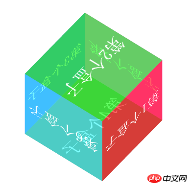
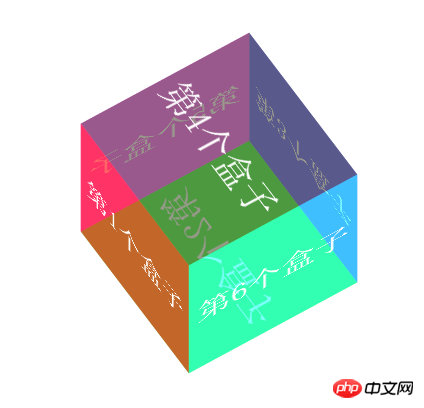
示例代码:
代码如下:
<!DOCTYPE html>
<html>
<head lang="en">
    <meta charset="UTF-8">
    <title></title>
    <style>
        * { margin: 0; padding: 0}
        ul {list-style: none;}
        ul {
            width: 200px;
            height: 200px;
            margin: 200px auto;
            position: relative;
            transition: all 6s;
            /*6秒时间转变*/
            transform-style: preserve-3d;
            /*放在父盒子内*/
        }
        ul li {
            width: 100%;
            height: 100%;
            position: absolute;
            text-align: center;
            line-height: 200px;
            font-size: 40px;
            color: #fff;
        }
        li:nth-child(1){
            transform: rotateX(0deg) translateZ(100px);
            /*translateZ是为了让立方体出现形状*/
            background-color: rgba(255, 0, 0, 0.6);
        }
        li:nth-child(2){
            transform: rotateX(-90deg) translateZ(100px);
            background-color: rgba( 0, 255,0, 0.6);
        }
        li:nth-child(3){
            transform: rotateX(-180deg) translateZ(100px);
            background-color: rgba(0,0,255,0.5);
        }
        li:nth-child(4){
            transform: rotateX(-270deg) translateZ(100px);
            background-color: rgba(50,50,25,0.5);
        }
        li:nth-child(5){
            transform: rotateY(-90deg) translateZ(100px);
            background-color: rgba(255,0,255,0.5);
        }
        li:nth-child(6){
            transform: rotateY(90deg) translateZ(100px);
            background-color: rgba(0,255,255,0.5);
        }
        ul:hover{
            transform :rotateX(360deg) rotateY(360deg);
        }
    </style>
</head>
<body>
<ul>
    <li>第1个盒子</li>
    <li>第2个盒子</li>
    <li>第3个盒子</li>
    <li>第4个盒子</li>
    <li>第5个盒子</li>
    <li>第6个盒子</li>
</ul>
</body>
</html>以上就是利用CSS代码实现立方体360度旋转效果实例展示的详细内容,更多请关注php中文网其它相关文章!

每个人都需要一台速度更快、更稳定的 PC。随着时间的推移,垃圾文件、旧注册表数据和不必要的后台进程会占用资源并降低性能。幸运的是,许多工具可以让 Windows 保持平稳运行。

 广告
广告Copyright 2014-2025 https://www.php.cn/ All Rights Reserved | php.cn | 湘ICP备2023035733号


 502
502


 收藏
收藏


