
详细介绍rem适配的实例代码
;
(function(win) {
    var doc = win.document;
    var docEl = doc.documentElement;
    var tid;

    function refreshRem() {
        var width = docEl.getBoundingClientRect().width;
        if (width > 540) { // 最大宽度
            width = 540;
        }
        var rem = width / 6.4;
        docEl.style.fontSize = rem + 'px';
    }

    win.addEventListener('resize', function() {
        clearTimeout(tid);
        tid = setTimeout(refreshRem, 300);
    }, false);
    win.addEventListener('pageshow', function(e) {
        if (e.persisted) {
            clearTimeout(tid);
            tid = setTimeout(refreshRem, 300);
        }
    }, false);

    refreshRem();

})(window);设置680原稿下的字体为100px,这样是为了方便计算
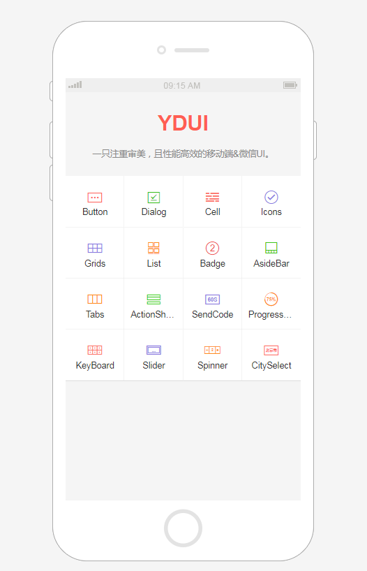
YDUI Touch专为移动端打造,在技术实现、交互设计上兼容主流移动设备,保证代码轻、性能高;使用 Flexbox 技术,灵活自如地对齐、收缩、扩展元素,轻松搞定移动页面布局;用 rem 实现强大的屏幕适配布局,等比例适配所有屏幕;自定义Javascript组件、Less文件、Less变量,定制一份属于自己的YDUI。
 81
81

以上就是详细介绍rem适配的实例代码的详细内容,更多请关注php中文网其它相关文章!

每个人都需要一台速度更快、更稳定的 PC。随着时间的推移,垃圾文件、旧注册表数据和不必要的后台进程会占用资源并降低性能。幸运的是,许多工具可以让 Windows 保持平稳运行。

 广告
广告Copyright 2014-2025 https://www.php.cn/ All Rights Reserved | php.cn | 湘ICP备2023035733号


 695
695


 收藏
收藏


