
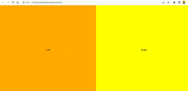
网格以行和列布局的形式排列内容。css网格也是如此。
将网格项设置为弹性容器−
display: flex
要垂直和水平居中,使用−
align-items: center;
justify-content: center;
让我们来看一个完整的例子 −
<!DOCTYPE html>
<html>
<head>
   <title>Grid and Flex Example</title>
   <style>
      html,body {
         margin: 0;
         padding: 0;
      }

      .box {
         display: grid;
         grid-template-columns: 1fr 1fr;
         grid-template-rows: 100vh;
      }

      .first,
      .second {
         display: flex;
         align-items: center;
         justify-content: center;
      }

      .first {
         background-color: orange;
      }

      .second {
         background-color: yellow;
      }
   </style>
</head>
<body>
   <div class="box">
      <div class="first">Left</div>
      <div class="second">Right</div>
   </div>
</body>
</html>
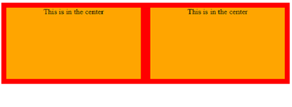
我们也可以不使用Flex来居中。我们将网格容器设置为display: grid。当display属性设置为grid时,HTML元素将成为网格容器 -
立即学习“前端免费学习笔记(深入)”;
grid-container {
   display: grid;
   grid-template-columns: 1fr 1fr;
   grid-auto-rows: 150px;
   grid-gap: 20px;
}
网格项目使用相对定位设置 -
grid-item {
   position: relative;
   text-align: center;
}
然而,
<!DOCTYPE html>
<html>
<head>
   <title>Grid</title>
   <style>
      grid-container {
         display: grid;
         grid-template-columns: 1fr 1fr;
         grid-auto-rows: 150px;
         grid-gap: 20px;
      }

      grid-item {
         position: relative;
         text-align: center;
      }

      grid-container {
         background-color: red;
         padding: 10px;
      }

      grid-item {
         background-color: orange;
      }
   </style>
</head>
<body>
   <grid-container>
      <grid-item>This is in the center</grid-item>
      <grid-item>This is in the center</grid-item>
   </grid-container>
</body>
</html>
以上就是如何在CSS Grid中居中?的详细内容,更多请关注php中文网其它相关文章!

每个人都需要一台速度更快、更稳定的 PC。随着时间的推移,垃圾文件、旧注册表数据和不必要的后台进程会占用资源并降低性能。幸运的是,许多工具可以让 Windows 保持平稳运行。

Copyright 2014-2025 https://www.php.cn/ All Rights Reserved | php.cn | 湘ICP备2023035733号


 328
328


 收藏
收藏


